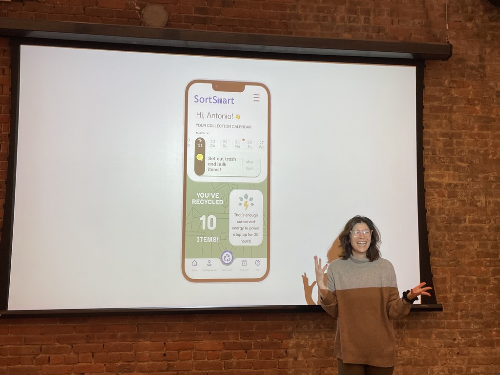
SortSmart Recycling App

Role:
Research
Prototyping
Testing
UI/Branding
Timeline: 10 weeks
Tools: Figma, Google Forms
Problem
77% of residents believe that recycling makes a difference, yet New York City has an alarmingly low recycling rate of 17%. The strict enforcement of curbside recycling initiatives has proven futile, highlighting a disconnect between effort and progress.
Approach
Hypothesizing that NYC's complex recycling system lacked clear and accessible resources for residents, I interviewed three individuals and distributed a digital survey to gather more insight. My research informed the development of SortSmart, an app allowing users to scan items and discover how to properly dispose of them within their municipality.
Impact
Two rounds of user testing showed a 100% success rate of navigating the scanning feature and learning how to dispose of an item.
If the SortSmart app was deployed, I would have liked to track the following metrics:
Retention rate
Rate increase in visits to local recycling centers reported by users or observed through partnerships with recycling facilities.
Percentage increase in the amount of recyclable material users report recycling in the app.
The Challenge
Recycling: Why is it Important?
Reduces our carbon footprint to help combat the effects of climate change.
Diverts waste away from landfills and incinerators.
Conserves natural resources like timber, water, and minerals.
Processing recyclable materials is more energy efficient.
The Good News
3/4 of the waste produced in the US is recyclable
77% of people believe that it does make a difference.
The Bad News
Only 21% of residential waste makes it through the entire recycling process!
Problem: there is a disconnect between people’s high recycling efforts and the less-than stellar rate at which it is successfully being done.
What’s Missing?

Ironically, researching this issue was as challenging as the recycling system itself, requiring me to sort through outdated government assessments and a dizzying amount of publication paywalls.
A 2024 report from the non-profit organization The Recycling Partnership provided me with the foundational statistics I needed to further develop my insights into recycling disparity across the nation.
Getting Specific
For major cities with recycling programs, San Francisco and Los Angeles are excelling in their efforts, while New York City has an uncharacteristically low rate of 17%.
This finding took me by surprise. I felt like the system was to blame and there was nothing we could do as individuals. But, as a user-centered designer, I was determined to persevere.
If we were going to have to follow the rules of a faulty system, there had to be a way to make our experience a little better.

The Goal
HMW: How might we offer residents of the New York City Metropolitan area a simple way to eliminate confusion around household recycling to validate their contribution to positive global change?
Primary Objectives
Find out what improvements residents would like to see in their current disposal programs.
Understand where people draw the line in their willingness to participate and defer responsibility to the city.
Learn about the residents of NYC and their recycling habits, access to resources, and views toward municipal mandates.
Survey | 156 Responses
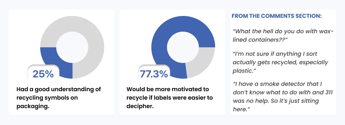
I sent out a Google Form via social media and received feedback from New York City Residents aged 18+, the majority of whom said recycling is extremely important to them but think the municipality can do better.
Interviews | 3 Participants
I conducted my interviews virtually, then synthesized the data into 5 key themes that reflected my users’ biggest pain points.

The most compelling data, from both survey and interviews, pointed to user’s confusion with sorting identification.
The Process
Persona
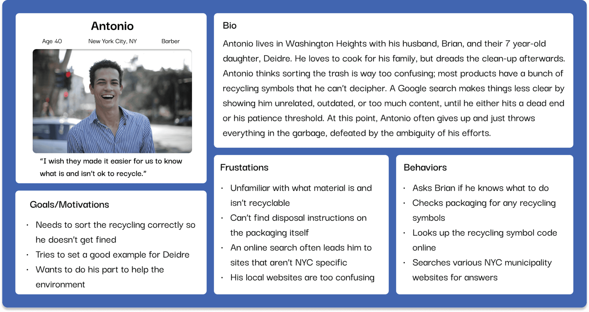
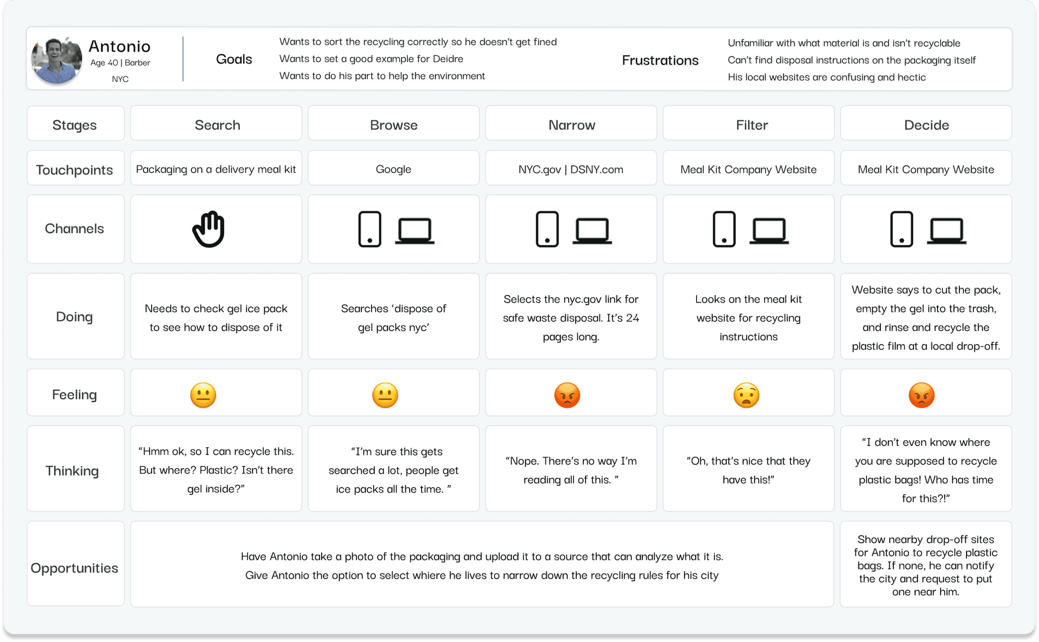
Using the key insights from my primary research, I created Antonio to help guide me through the design process.
Experience Map
I wanted to look at a specific instance that would make recycling difficult for Antonio, so I followed him as he tried to dispose of the packaging from his meal kit.
User Stories
Considering Antonio’s experience, I authored 32 user stories and explored possible epics based on task patterns.

Users must successfully recycle an item before they can do anything else, so I chose this as my core theme and generated more stories in preparation for a task flow.

Task Flow
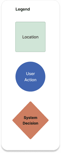
With a refined understanding of my user’s goals and pain points, I designed the simple user task of scanning an item and learning how to dispose of it.

Inspiration + Sketching = Wireframe Prototypes
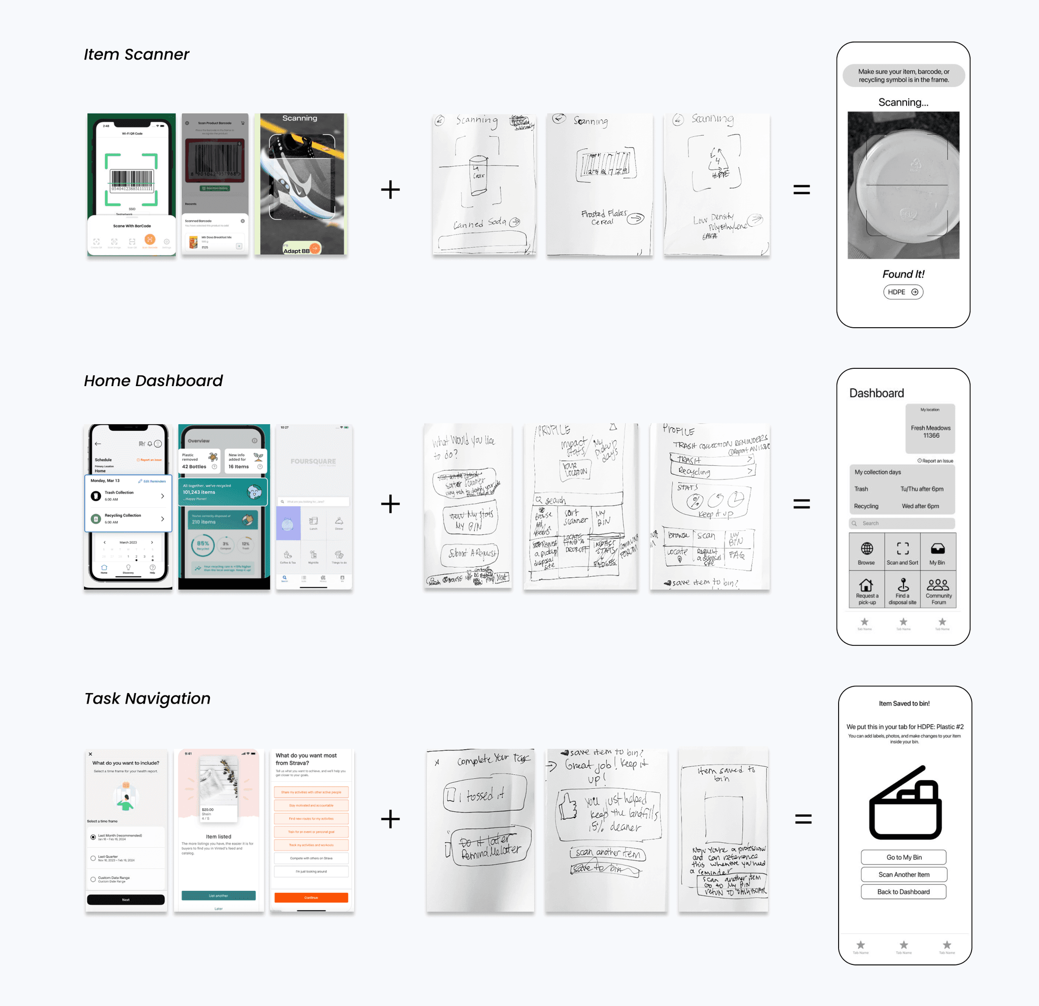
I gathered inspiration to create rough sketches and wireframes of my task flow. I chose these as my testing prototypes to ensure the usability was solid before adding more high-fidelity elements.
Developing a Visual Identity
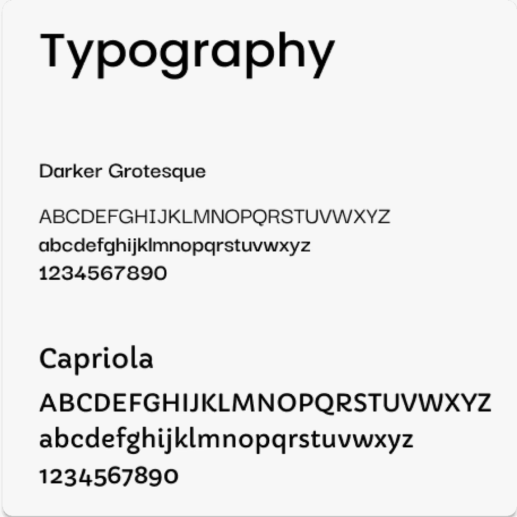
Confident in what I had created as a user experience, I moved onto UI and branding, exploring typography, copy, and color.
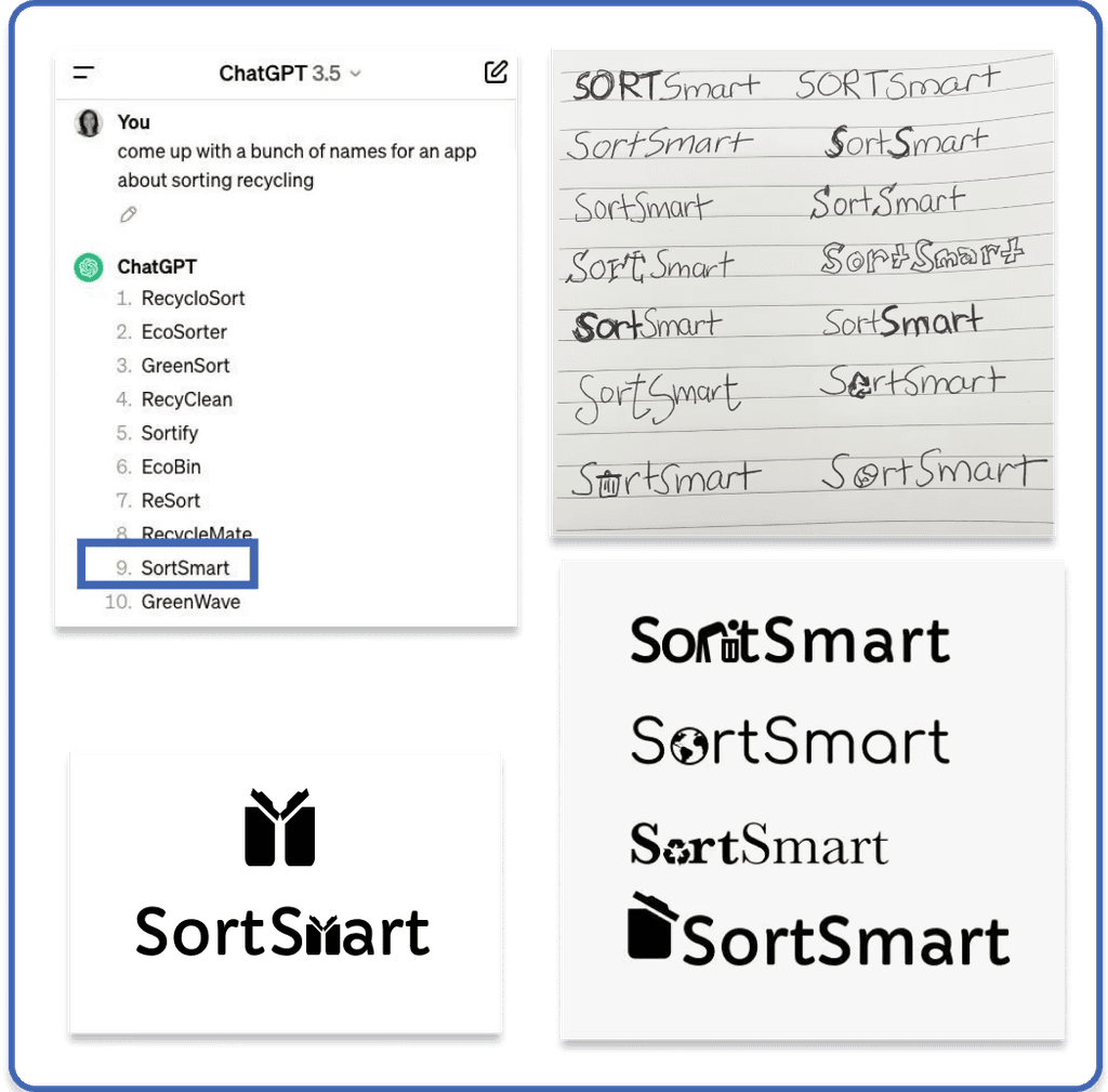
I used Chat GPT to brainstorm app names, then sketched out wordmark ideas and played around with fonts, icons, and typography to ensure a cohesive style and tone.
Mood Board + Color Exploration
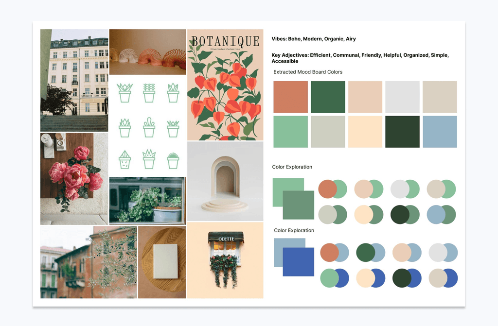
I gathered inspiration to reflect the traits I wanted my app to elicit: friendliness, accessibility, efficiency, and community.
Keeping accessibility at the forefront of my design, I relied heavily on the WCAG color contrast guidelines throughout this process.
Color Palette
I noticed that my original color extractions did not meet the WCAG guidelines, so I found success in deeper brand colors that worked better with lighter neutrals.

The Impact
User Testing
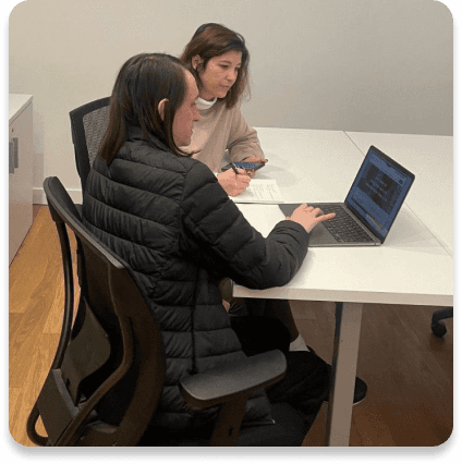
I conducted two separate rounds of in-person testing, iterating on my mid-fidelity prototypes after each set of feedback.
Testing Overview
Participants ages 26-38, NYC Residents
Asked to scan and sort an item using the app
100% success rate!
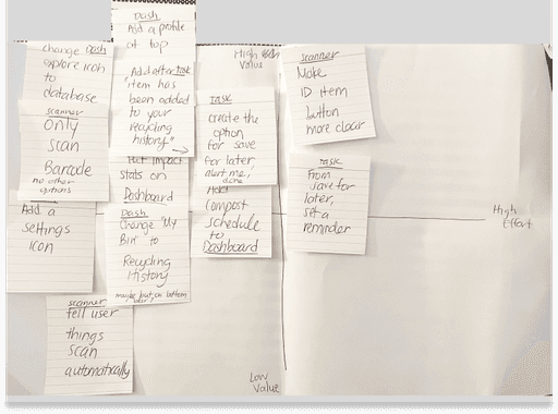
Matrix | View in Hi-Fidelity
Top Issues
Needs more straightforward microcopy
Eliminate unnecessary features, like location widget
Cluttered layout
Notable Changes
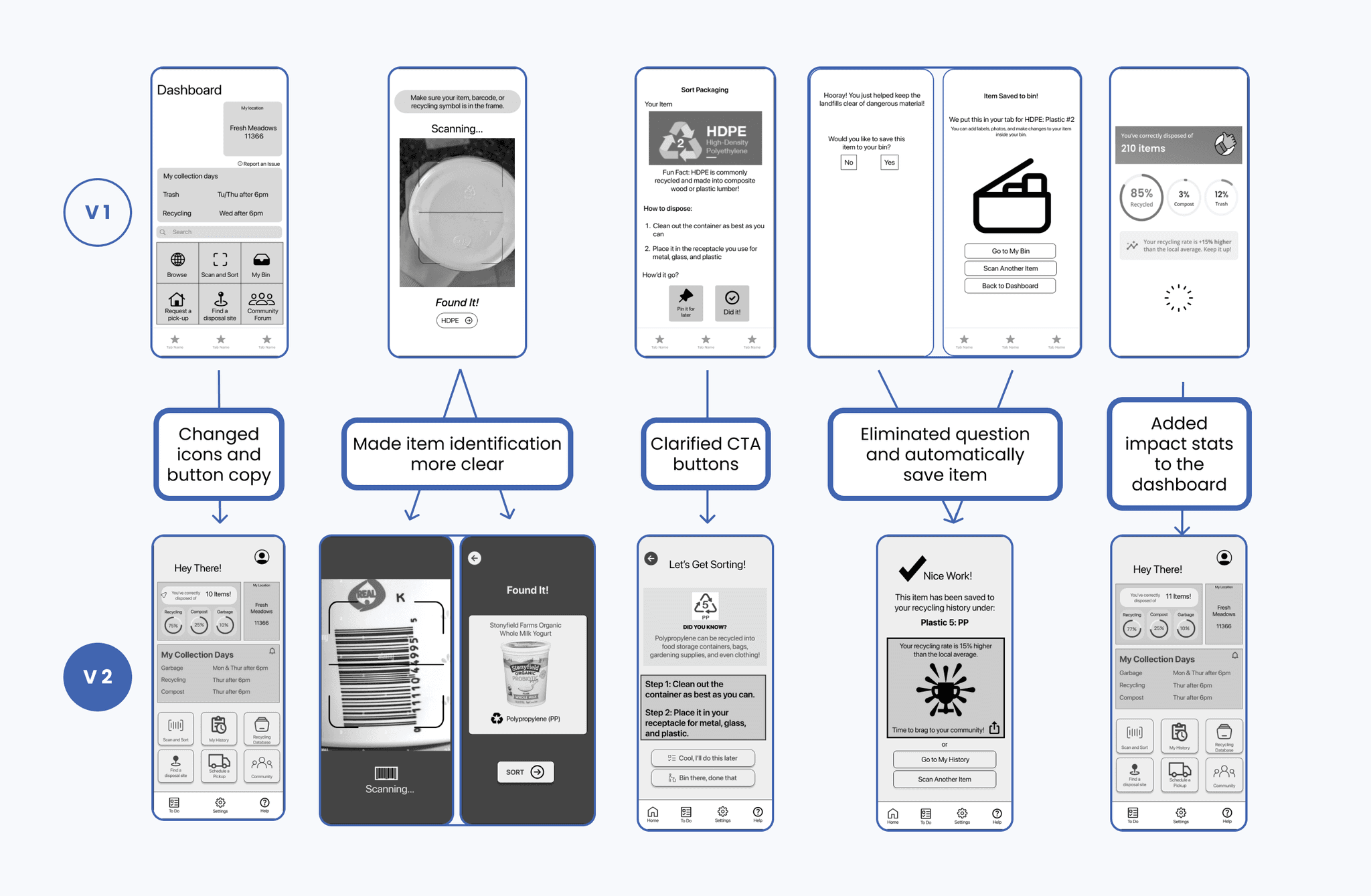
Hi-Fidelity Prototype
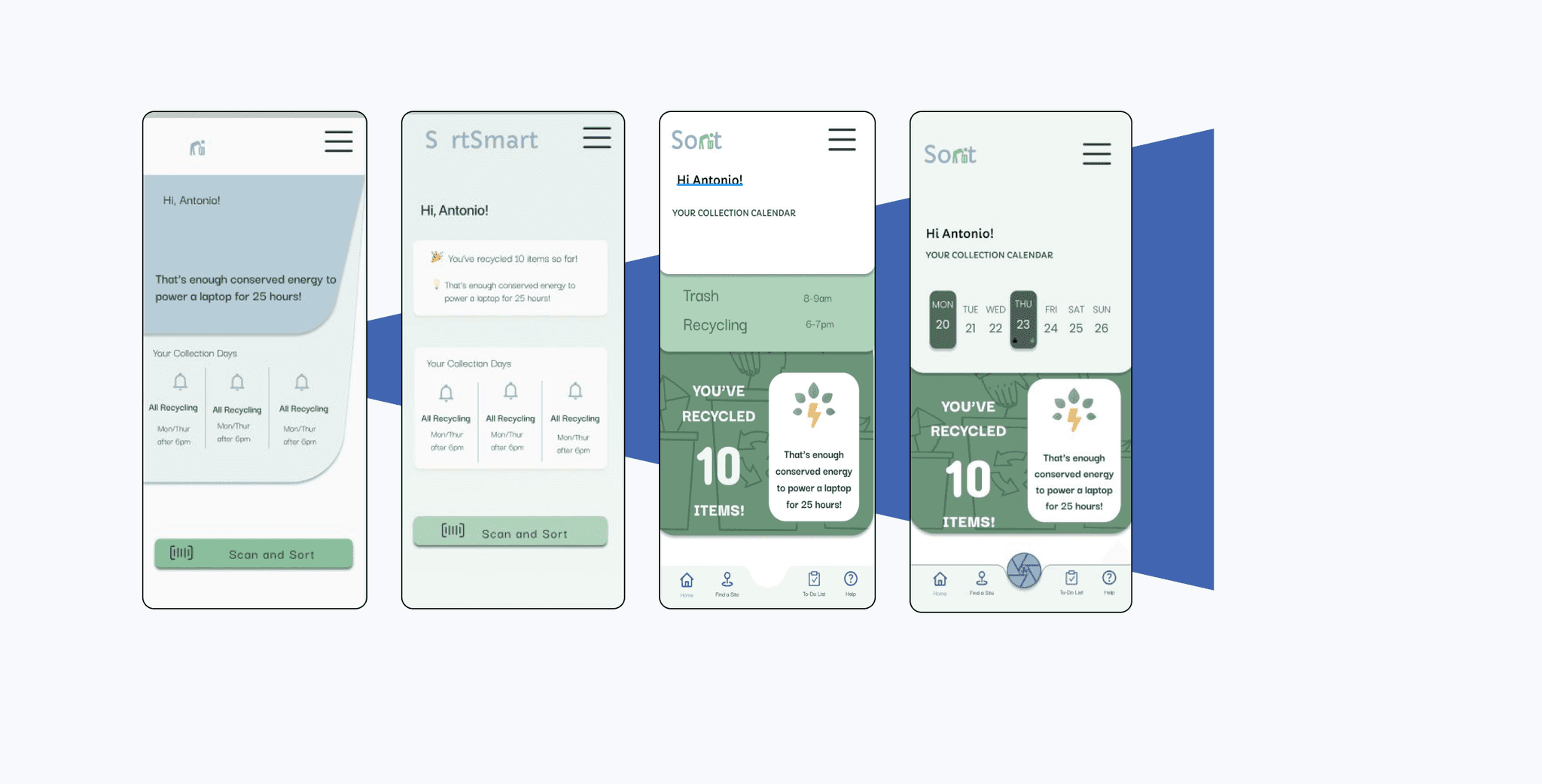
Implementing my UI elements and the feedback from my second round of user testing, I went through multiple iterations to find a design that embodied a friendly, usable, and enticing recycling app.
Key Learnings
From a research perspective, I found a few flaws in my Google Forms survey. Had I condensed the amount of questions and really honed in on insights that directly supported my problem, I could have had even stronger data to support my findings.
Less is more in UI. I was very excited about all of the features I could make available to my users, but had trouble finding out where to put them when the key focus was on one task. Simplifying content and copy was a challenge, albeit a necessary one.
One survey participant requested I send her my findings, as she works for the GAIA (the Global Alliance for Incinerator Alternatives) on fighting incineration, plastics, and for zero waste cities. While it is unclear if any data will be useful to her, it is exciting to see confirmation of people wanting to make a difference.
What’s Next?
Build out a flow for a more complex recycle task, such as mixed packaging material or finding a disposal site for an item.
Ideate a design for “my history” page. This would reflect all of the past scanned items and allow the user to see the outcome of their efforts.
I had a few people reveal themselves in my anonymous survey and request a summary of my final project, so I’d like to reach out update them on my findings.
